Villaggio
29 May 2025
29 May 2025


I spent a couple of summers in Sweden when I was a child. My dad worked for a Swedish company in the Netherlands. I don’t think they owned the holiday park where we stayed, but at least they reserved part of it for their employees. It must have been somewhere in the Stockholm archipelago, because I remember visiting the capital, and the park having small boats available to navigate the surrounding waters. It also had a tennis court, and best of all, a sort of community building where breakfast was served. Food that I’d never had before, and certainly not for breakfast, like smörrebröd and meatballs with blackberry marmalade, generously heaped on large plates.
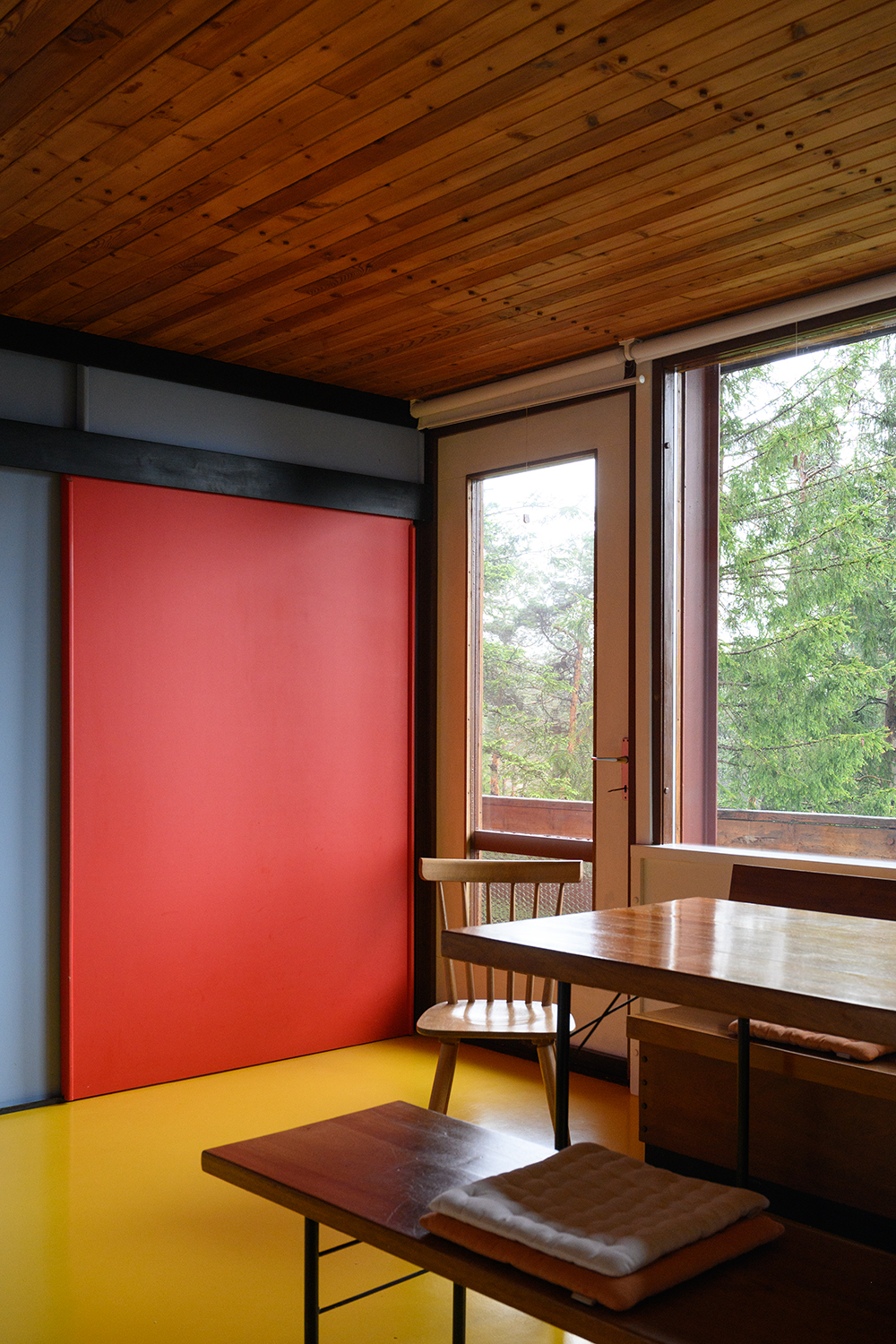
I was thinking about this when I looked into the history of our temporary home in Borca di Cadore. Villaggio ENI was initiated by Enrico Mattei, the chairman of Italy’s largest oil company, and designed by architect Edoardo Gellner between 1954-1957. A holiday village offering a range of accommodation for ENI employees and sick staff who would benefit from the crisp mountain air. A socialist dream of community, connecting with nature and an architecture devoid of local folklore, in favour of raw concrete, glass and wood. Gellner also designed the villas’ interiors and furniture, using a colour palette of contrasting hues, such as yellow, blue and red, inspired by Californian modernist Richard Neutra.
I was thinking about this when I looked into the history of our temporary home in Borca di Cadore. Villaggio ENI was initiated by Enrico Mattei, the chairman of Italy’s largest oil company, and designed by architect Edoardo Gellner between 1954-1957. A holiday village offering a range of accommodation for ENI employees and sick staff who would benefit from the crisp mountain air. A socialist dream of community, connecting with nature and an architecture devoid of local folklore, in favour of raw concrete, glass and wood. Gellner also designed the villas’ interiors and furniture, using a colour palette of contrasting hues, such as yellow, blue and red, inspired by Californian modernist Richard Neutra.
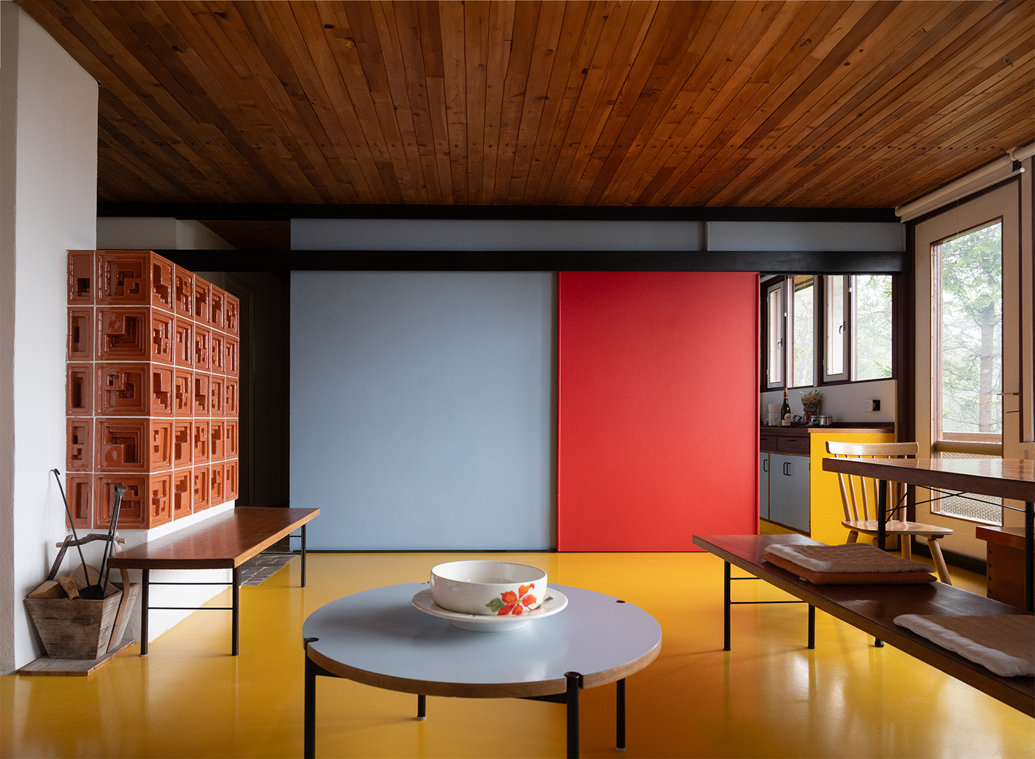

It's not quite clear how much of the interior of our home was original. Photos suggest that two adjacent rooms had been
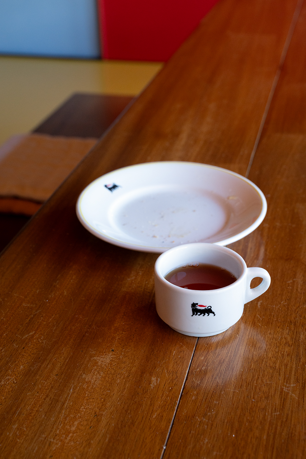
joined together and that the kitchen door had been replaced with a sliding door. Most of the furniture appeared to be original, with some pieces bearing name tags and serial numbers. In one of the kitchen cupboards I found piles of dinner plates and cups with a logo that I recognised as the Agip petrol station logo, and we joked that the landlord got his crockery by saving stamps.
Agip was a product of the Italian fascist regime. After the Second World War, Mattei was appointed to oversee the dismantling of Agip, but rather than abolishing it, he transformed it in terms of content, structure and ideology. Under the umbrella of ENI, which was founded in 1953, he turned Agip into a cornerstone of a modern, independent Italian energy empire with a strong social agenda. The famous six-legged, fire-breathing dog logo was designed in 1952, after the fascist period. Retaining the Agip logo despite the company’s origins can be understood as an example of strategic rebranding and cultural reappropriation. It decorated vases, plates and cups, custom-designed by Gellner himself.
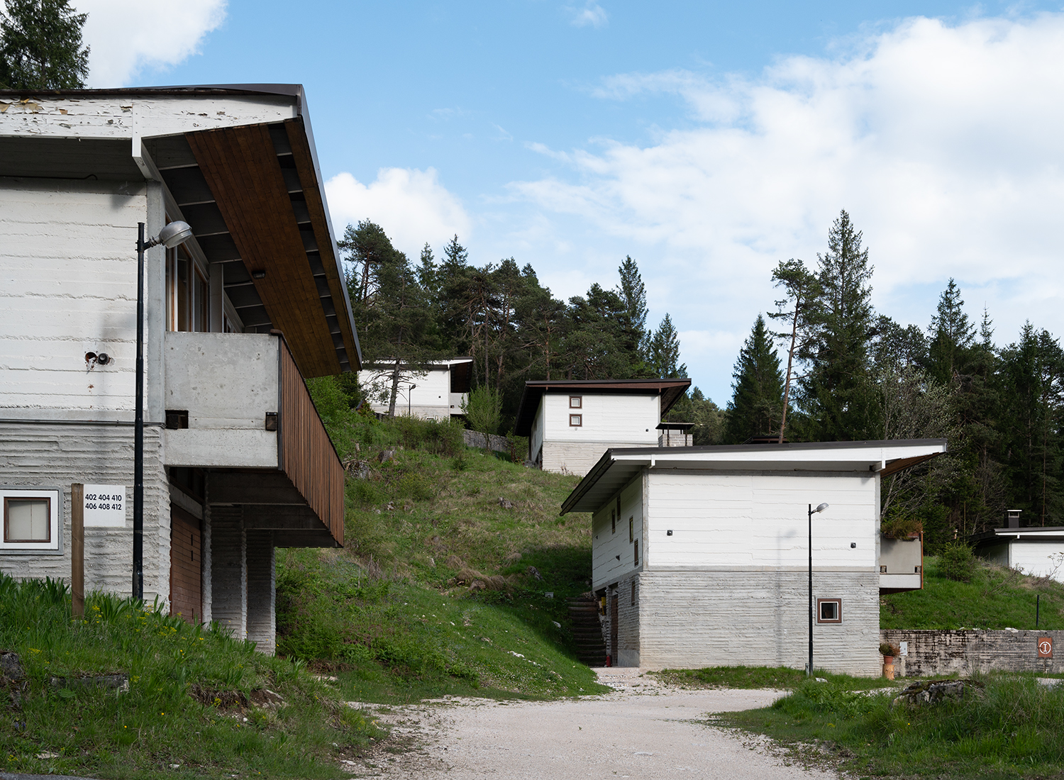
Mattei's death in a plane crash in 1962 marked the end of his ambitious utopia. Although the village was never completed, the existing buildings continued to accommodate guests until 1992. The following years were marked by neglect and decay until, in 2000, the entire structure was sold to a Sardinian company. This marked the beginning of a slow ascent. In 2014, Progettoborca was established to introduce new ideas and initiatives to breathe new life into the property. Exploring the area, we saw reconstruction work taking place at the hotel and spa. The ‘colony’, which could accommodate 600 children, is now a gated construction site and an artists' and architects' residence, with tours every now and then. But a full-fledged renovation doesn’t seem to be happening. Perhaps the 2026 Winter Olympics in Cortina, only 15 miles away, will provide the incentive needed to change that.
Agip was a product of the Italian fascist regime. After the Second World War, Mattei was appointed to oversee the dismantling of Agip, but rather than abolishing it, he transformed it in terms of content, structure and ideology. Under the umbrella of ENI, which was founded in 1953, he turned Agip into a cornerstone of a modern, independent Italian energy empire with a strong social agenda. The famous six-legged, fire-breathing dog logo was designed in 1952, after the fascist period. Retaining the Agip logo despite the company’s origins can be understood as an example of strategic rebranding and cultural reappropriation. It decorated vases, plates and cups, custom-designed by Gellner himself.
Mattei's death in a plane crash in 1962 marked the end of his ambitious utopia. Although the village was never completed, the existing buildings continued to accommodate guests until 1992. The following years were marked by neglect and decay until, in 2000, the entire structure was sold to a Sardinian company. This marked the beginning of a slow ascent. In 2014, Progettoborca was established to introduce new ideas and initiatives to breathe new life into the property. Exploring the area, we saw reconstruction work taking place at the hotel and spa. The ‘colony’, which could accommodate 600 children, is now a gated construction site and an artists' and architects' residence, with tours every now and then. But a full-fledged renovation doesn’t seem to be happening. Perhaps the 2026 Winter Olympics in Cortina, only 15 miles away, will provide the incentive needed to change that.